
Scalable Design System for Learning Material at Handshake AI
Handshake AI's Learning Team was only seven months old when they brought me in. They were moving fast in a company moving faster and needed to Design System to scale quality instruction for LLM trainers (called Fellows).
Operators were creating project instructions for Fellows but the result was information dumps with no pedagogical logic and no visuals to aid comprehension. The Learning Team was spending valuable time doing basic cleaning of instructions, and as such were unable to focus on more high-impact pedagogical, structural issues. In addition, when Fellows moved between projects the inconsistency was jarring.
O V E R V I E W
Role
As an Independent Consultant, I conducted a content audit, interviewed Learning Designers and Operators to surface pain points, and sourced visual brand guidelines from the Marketing team. From there I worked largely autonomously to design the system end to end.
Objectives
Design and deliver a scalable learning design system that standardized how operators structured and presented training materials across all client projects.
Business Outcomes & Impact
The engagement ended up with 2 different forms of training material” the Playbook and WebApp prototype.
Playbook: Before the engagement closed, the playbook template was already in active use — onboarding new operators and realigning existing ones.
WebApp Prototype: The full design system prototype was handed off to the Product, Design, and Engineering team for implementation.*
As a fast-moving startup, the system has likely evolved since handoff — which was always the intention. My work set up the infrastructure for the team to adapt.
D E S I G N P R I N C I P L E S
Intuitive Information Architecture
The Playbook and WebApp had to make immediate sense for both the Fellows and internal team creating the training. No hunting or guessing page functions or flow.
Radical Brevity
No paragraph exceeds 2-3 lines. If longer than that, a visual should be used to avoid abstract overexplanation for a team that needs to use their energy for other things.
P R O C E S S
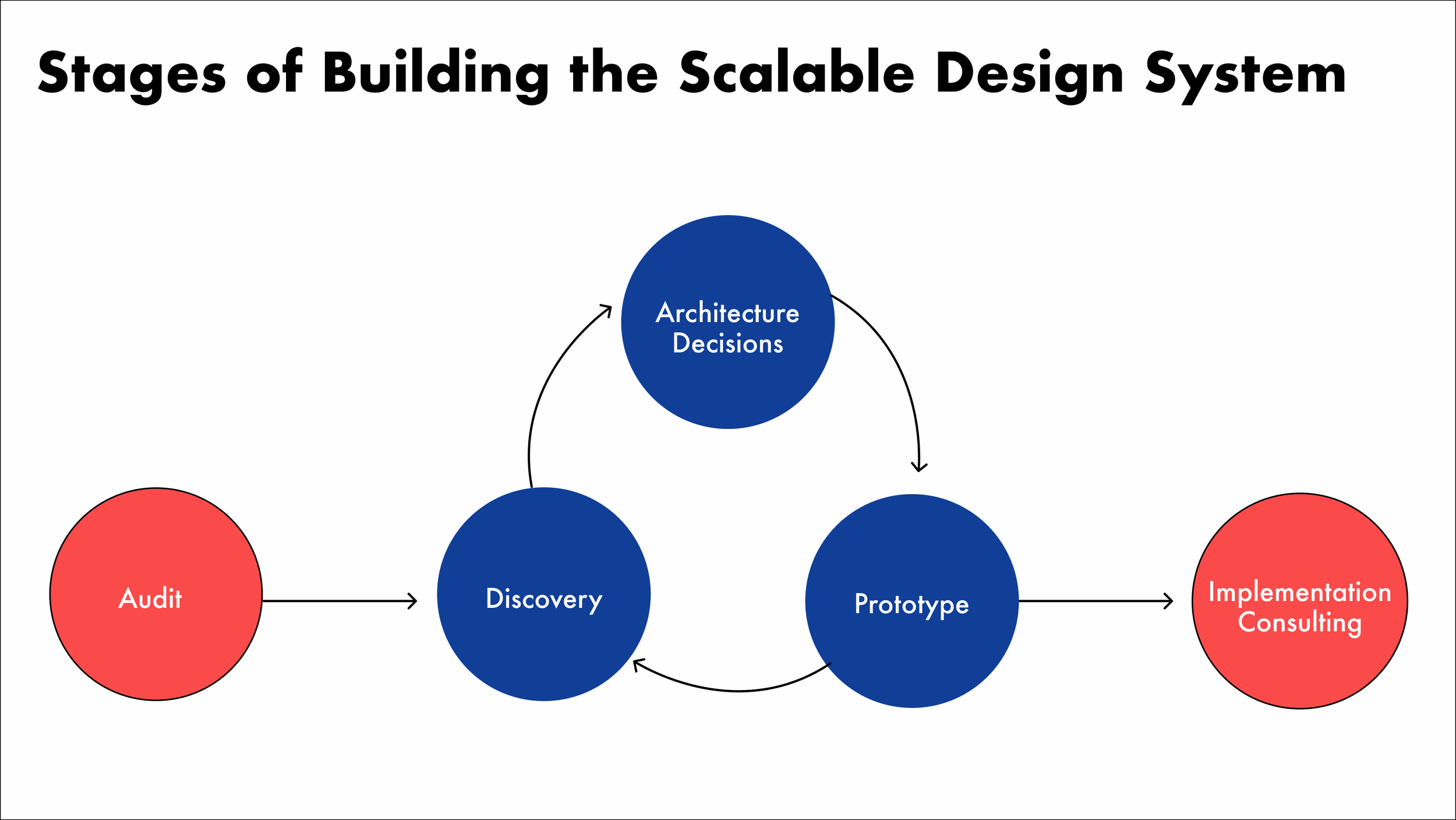
Audit
I started reviewing current training materials, noting current issues that made the training hard to understand.
Discovery
I then conducted interviews with Learning Designers and Operators to understand how they actually worked and where the bottlenecks were. I also observed the Learning Design team's exchanges with Operators in real time to get a sense of how I could optimize the design system to as useful to them.
Some of the issues I found were:
People created training from scratch or "played telephone” by using old training as a template and changing stuff where needed, even if the old training wasn't optimal.
Client specs and demands were iterative.
Walls upon walls of text describing technical tasks where a visual aid would have cut the length of words + made things much faster to understand.
Chaotic sidebar structure with confusing flows
Pages with confusing names, with little to no context.
Unnecessary duplicate information causing confusion.
Architecture Decision
From the audit and discovery phase I came up with some architecture design decisions and visual choices. As mentioned, the team was moving fast so the actual medium of the deliverable changed several times, but what did not were the design principles. The three main principles were:
Intuitive Information Architecture
The Playbook and WebApp had to make immediate sense for both the Fellows and internal team creating the training. No hunting or guessing page functions or flow.
Modular
The training team had a few types of projects that were similar but different enough that one single template would be too limiting. The Design System components had to be comprehensive but easy enough to move or delete what wasn't needed.
Radical Brevity
No paragraph exceeding 2-3 lines. If longer than that, a visual should be used to avoid abstract overexplanation for a team that needs to use their energy for a lot of other things.
Prototype
Modular
The training team had a few types of projects that were similar but different enough that one single template would be too limiting. The Design System components had to be comprehensive but easy enough to move or delete what wasn't needed.
As I formed the design principles, and spoke to stakeholders, I set to work to building the actual system. This comprised:
A plug-and-play playbook template complete with a plug-and-play visual library
WebApp vibe coded in Lovable and Vercel.
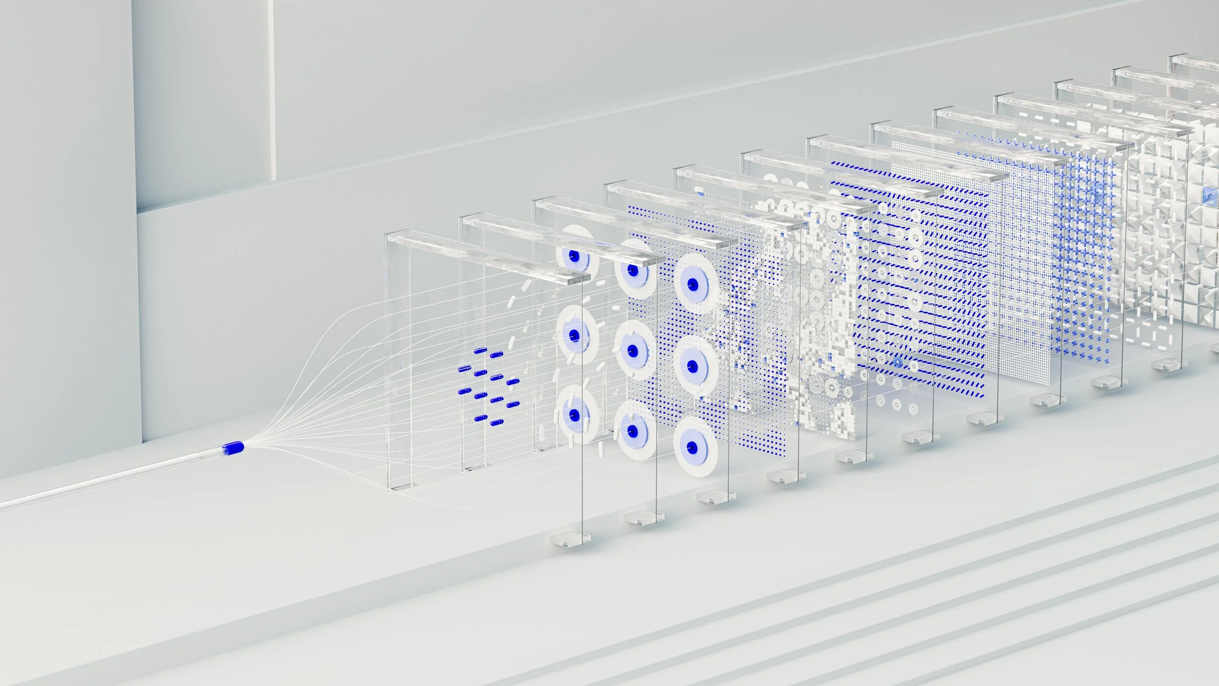
*Actual visuals not shown for NDA purposes
Implementation Consulting
To avoid the deliverables becoming well designed documents that nobody used, I consulted with the Learning Team manager on adoption strategy. The high-speed environment could easily risk having operators defaulting back to old habits.
The recommendation was simple: bake it into operator onboarding from day one so using it wasn't a choice, it was just how things were done.
By the time I left, the playbook template was already in active use — folded into operator training before the full system even reached Product, Design, and Engineering for implementation.