

MIT Sloan: Designing for Faculty Independence
The Teaching Learning Technologies (TLT) team at MIT needed presentation materials for faculty. The TLT team would already spend time crafting content with faculty and rarely had time to help them with deck quality and brand-alignment. The bigger challenge wasn’t just the look of the slides but building a self-service system so faculty could produce polished, on-brand decks independently.
D E S I G N P R I N C I P L E S
Intuitive Setup + Design
Professors' should be able to look at the templates and have a sense of what can/should go on which slides just by seeing the way I've set them up
Legible Instructions
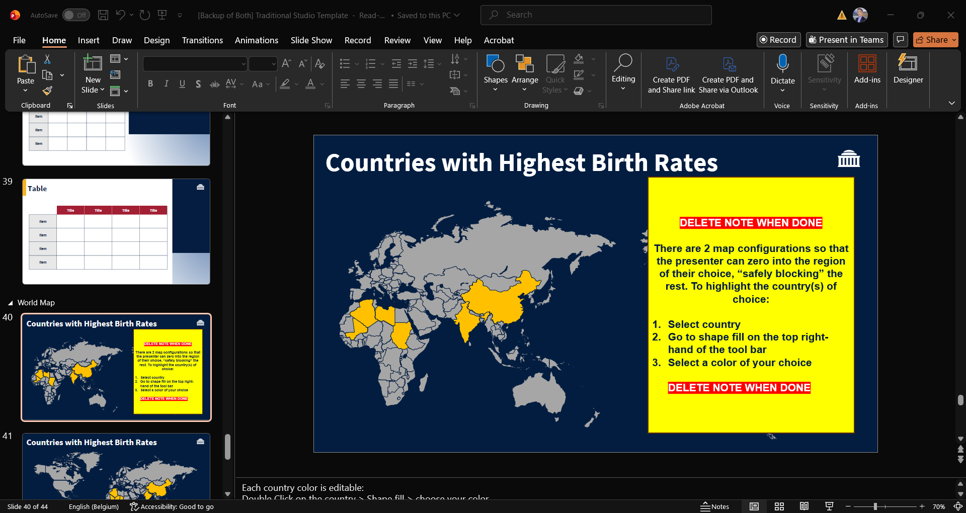
For some slides that need customization, instructions on how to change things out should be hard-to-miss. They should also be clear and straight to the point.
Visually Comfortable
The design of the slides had to feel “familiar but better” in order to dissuade professors from using their own slides.
P R O C E S S
Establish the range of Professors who will be using the templates
In order to hook the professors into using the templates, the visual design had to match their energy. Balancing the reality that not one-style fits all, and choice overload, I decided on three professor archetypes that would transform into three template styles:
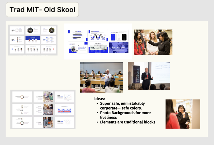
Traditional
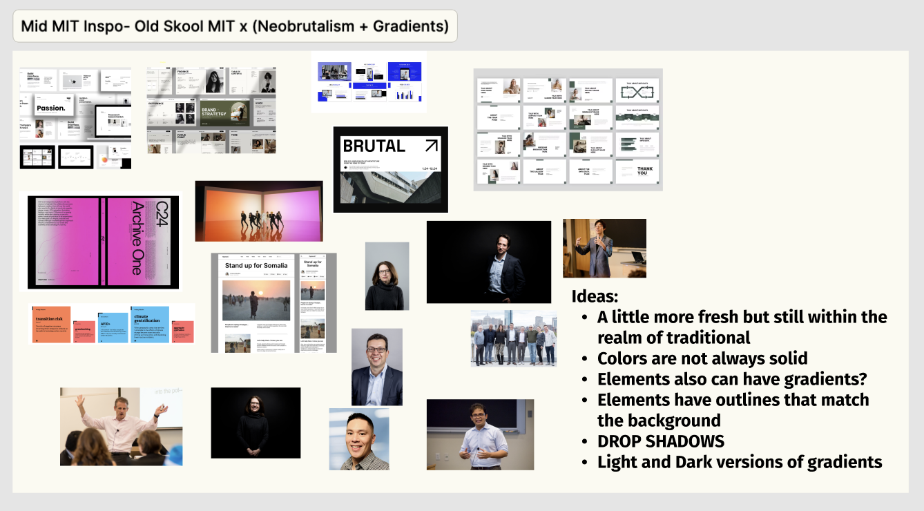
Mid-Modern
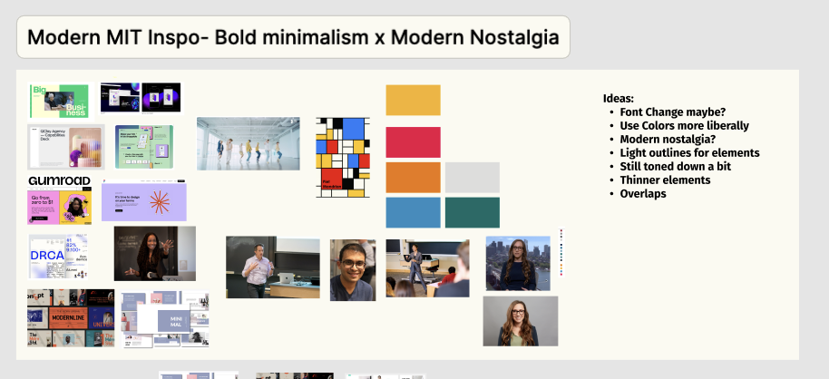
Modern
Mood Boards for the visual identities
Establish types of slides they would need
The slides had to not just look good but set up to make transfer of content seamless. When a professor sees a slide, they should know what type of content should go in there without needing any instructions.
Looking through some old presentations, I did a short audit and created these learning-content specific slides in the three visual identities.
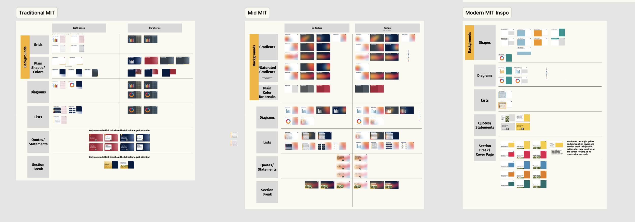
Building the visual identities side-by-side
Embedded instructions
Professors’ mental energy should be spent on their content, not on the technicalities of what to put on the slides to preserve the design. To avoid this, I did two things:
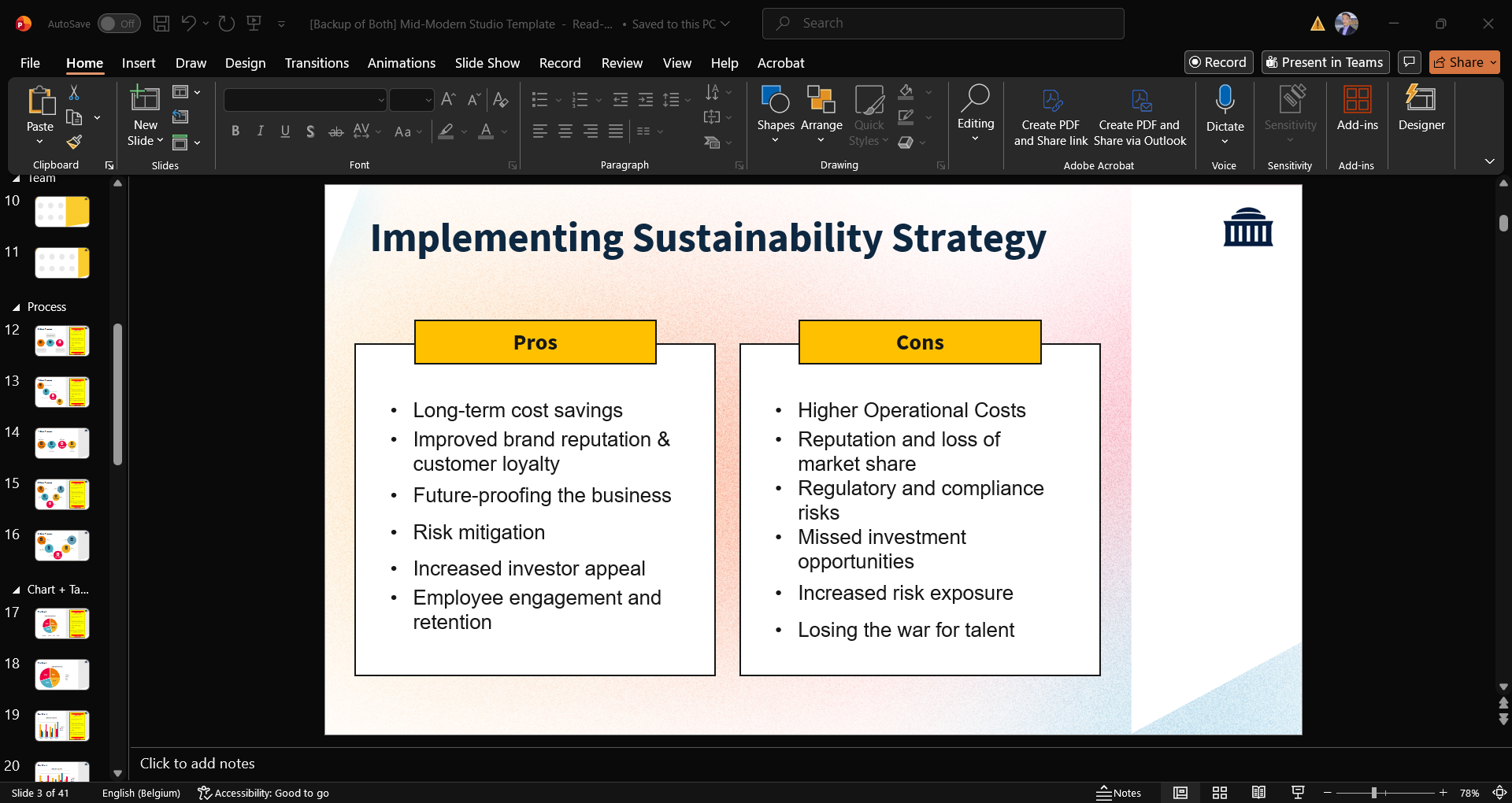
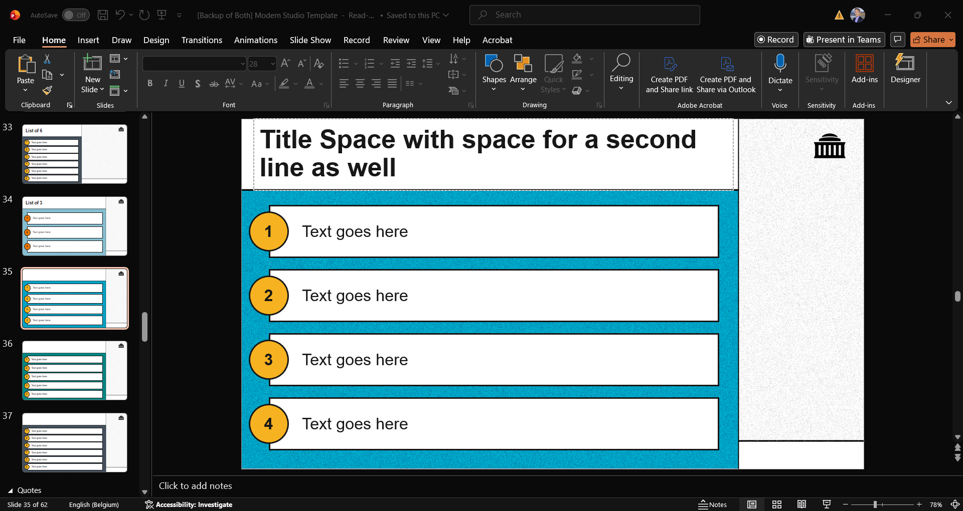
Filled placeholders with labels of what should go there, or dummy text
Put out-of-place “labels” with instructions where customization of the slide might not be as intuitive.
Embedded instructions
Professors’ mental energy should be spent on their content, not on the technicalities of what to put on the slides to preserve the design. To avoid this, I did two things:
Filled placeholders with labels of what should go there, or dummy text
Put out-of-place “labels” with instructions where customization of the slide might not be as intuitive.
Implementation
By the time I left my MIT Sloan engagement, the introduction of the templates were part of new professor onboarding. It had also been used to give a presentation by TLT on StackAI to the school community.
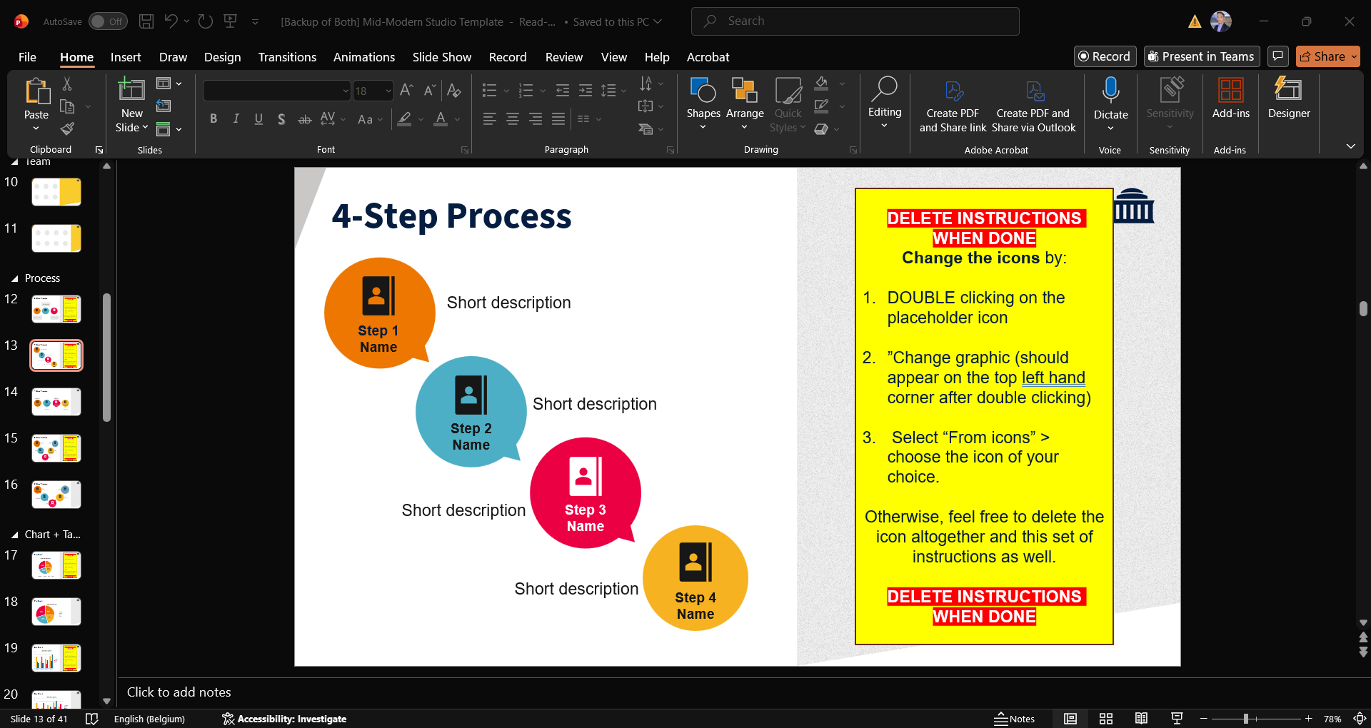
Making Instructions hard-to-miss and straightforward